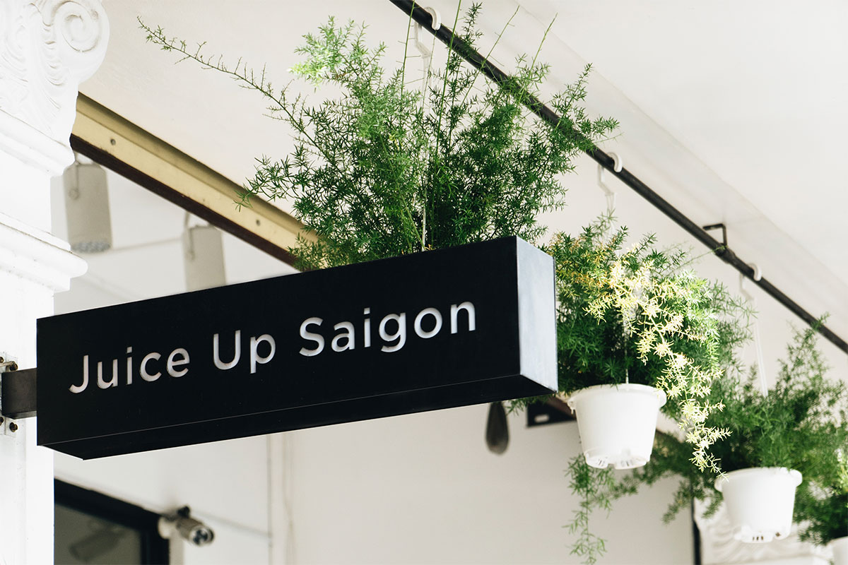
When writer browses through the net and found this link, the simple yet appealing design of this new sensation of JUS • Juice Up Saigon really caught her attention.
As a juice lover, her temptation to taste those range of juices by this raw, cold-pressed juice company which was founded in September 2015, really get triggered especially by the jubilant, vibrant colours available chosen for different flavours of juices.
Let's have a look at what JUS • Juice Up Saigon is, that born from the three people that have the same love for a healthy life, where their journey starts from Saigon, one of the busiest city in Southeast Asia.
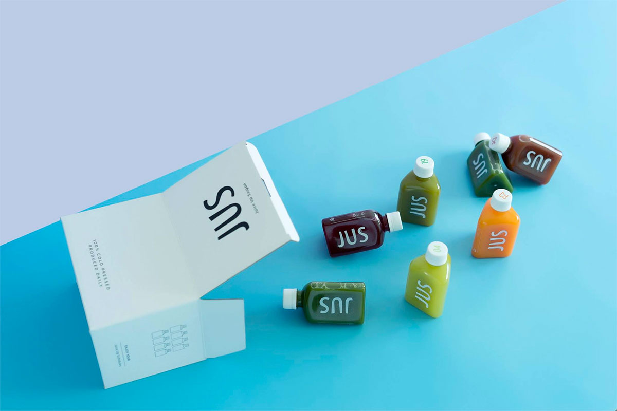
The brand offers a simple, delicious way to integrate plant-based health into a busy lifestyle because the founders believe that nutritious and delicious juices can be ready-made for everyone.
Our task was to research and find the right design solution, both in terms of the visual identity as well as the art direction, to create a unique, sustainable juice brand in Vietnam. As cold-pressed juice is a new product in Vietnam, JUS is the pioneer that’s breaking the barrier.
Based on the concept of a yoga triangle to connect the body, spirit, and mind, we created a unique bottle in the shape of an equilateral triangle.
The JUS logo was kept as simple as it needed to be, with curved characters and an imbalance to create a natural impression suited to the organic ingredients.



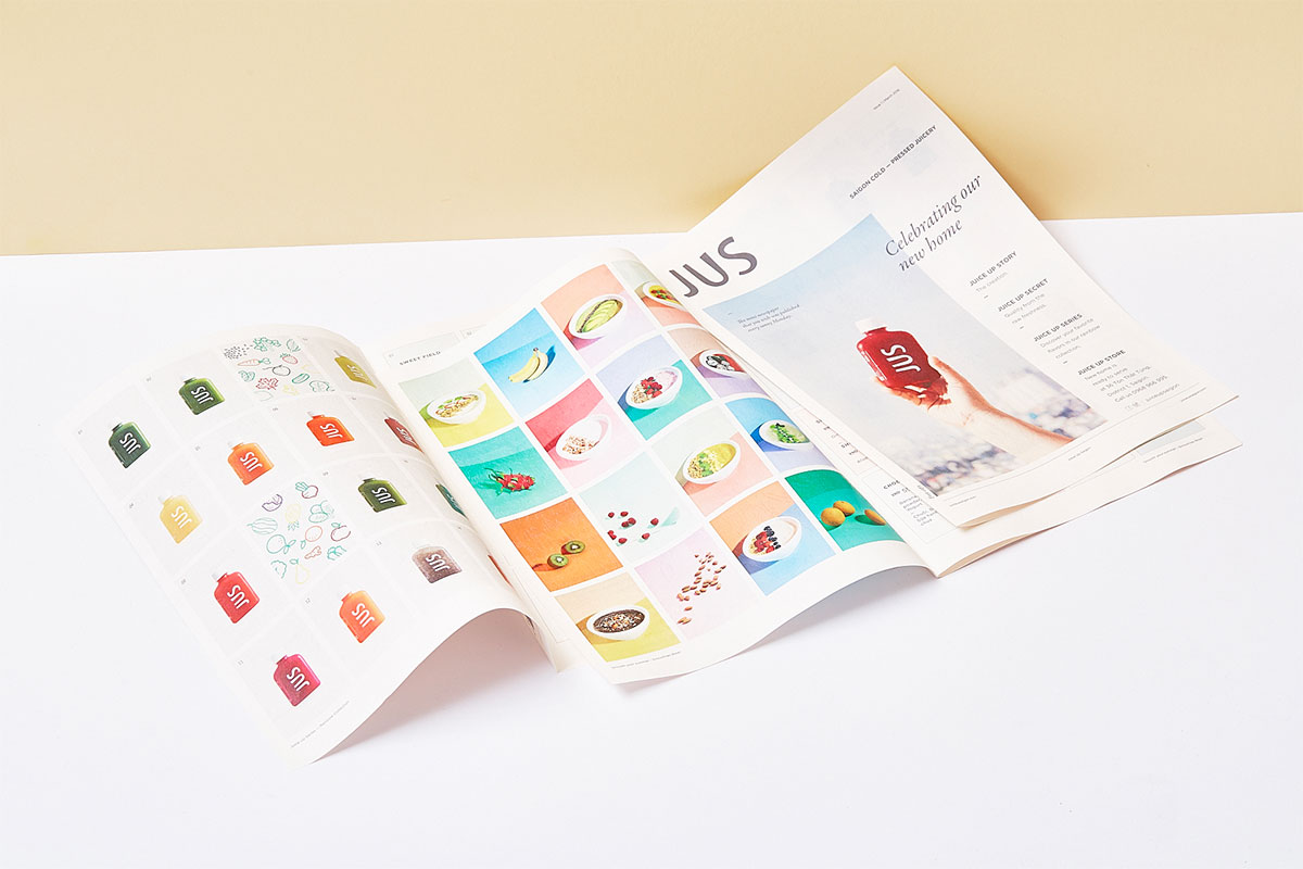

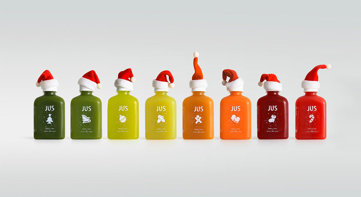
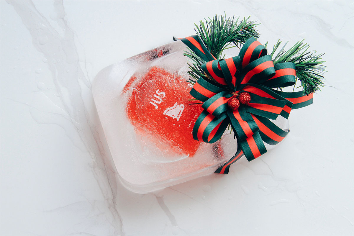
For this Christmas, special Juice Up Santa is made available special.
It is a seasonal project that lets us give JUS some flexibility in the marketing, from packaging to social media, by developing a series of Christmas icons. We created a series of miniature scenes to mimic the festive theme and iconic characters in order to give each JUS bottle its own “human” characteristic.
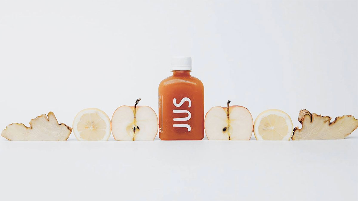
It's even nicely photographed by the team.
Since cold-pressed juice is a completely new product in Vietnam, JUS • Juice Up Saigon is the pioneer to break the barrier, therefore, the challenge is huge.
Based on the concept of an equilateral triangle of yoga that connects body - spirit - mind together, the creative agency named M - N Associates created a unique equilateral triangle bottle shape.


