


For centuries, one of the world’s most familiar maps has made Africa look smaller than it really is. That may now begin to change.
On September 4, 2026, the United Nations General Assembly adopted the “Correct the Map” resolution by a vote of 164 in favour, one against, and six abstentions. The resolution calls on governments, schools, media organisations, and technology companies around the world to move away from the Mercator projection and use equal-area projections such as Equal Earth when the relative size of continents matters.
The United States was the only country to vote against it. The country described the resolution as a “radical ideological project.”
The resolution, recorded as document A/80/L.104, does not ban the Mercator projection. Instead, it says that the projection has contributed for decades to the “symbolic minimization” of Africa in the eyes of the world.
The debate is not really about whether the Earth has changed. It is about how a flat map makes the Earth look.
A Map Made for Ships, Not Geography Class
Gerardus Mercator, a Flemish cartographer, created the Mercator projection in 1569. Its original title was “A new and enlarged description of the Earth, corrected for the use of sailors.”
Its purpose was specific: navigation. On a Mercator map, a straight line represents a constant compass direction. This allowed navigators to plan sea routes without constantly correcting their course.
There was a trade-off. Mercator used a cylindrical projection that mathematically enlarges areas farther from the Equator. The farther a place is from the Equator, the greater the distortion becomes.
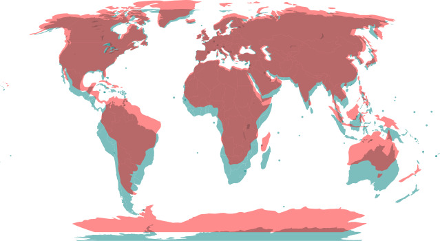
Greenland is a striking example. The island has an actual area of about 2.17 million square kilometres, while Africa covers about 30.3 million square kilometres. Yet on a Mercator map, Greenland can appear close to Africa in size. In reality, Africa is nearly 14 times larger.
The map was doing exactly what it was designed to do. But the same feature that made it useful for sailors also changed how people saw the relative size of the world.
The First Attempt to Correct the Map
The first equal-area projection to challenge Mercator’s dominance was created more than a century ago. In 1855, the Reverend James Gall developed an equal-area projection, but it received little attention at the time.
The projection returned to public attention in 1973, when German historian Arno Peters promoted it as a tool for social justice. Peters argued that it could help address the Eurocentric bias of the Mercator map.
The projection became known as the Gall-Peters projection. It did preserve the relative size of continents, but it came with another trade-off: shape. Tropical regions become significantly elongated, which drew criticism from many cartographers. Even so, the projection later found a place in classrooms.
In 2017, Boston Public Schools became the first public school district in the United States to officially switch from Mercator to Gall-Peters maps in its classrooms. The change was part of a three-year effort to “decolonize the curriculum.”
Equal Earth Tries a Different Approach
The visual limitations of Gall-Peters led cartographer Tom Patterson to look for another option.
Patterson, a retired United States National Park Service cartographer, wanted an equal-area projection that would preserve relative size while looking more proportionate. Together with Bernhard Jenny and Bojan Šavrič, he developed the Equal Earth projection in 2018.
The results were published in the International Journal of Geographical Information Science. Equal Earth keeps lines of latitude and the central meridian straight. Its other meridians curve outward.
The result is a map with continental shapes that appear closer to their original proportions than they do on Gall-Peters. At the same time, Equal Earth remains mathematically equal-area, meaning the size of a region on the map remains proportional to its actual area on Earth.
It does not eliminate every distortion. No flat map can perfectly reproduce a three-dimensional planet. Instead, it makes a different choice about what should remain accurate.
From an African Campaign to the UN
The push behind the UN resolution began in August 2025, when Africa No Filter and Speak Up Africa launched the #CorrectTheMap campaign. The African Union later gave the campaign its official support.
The campaign argued that when Africa appears smaller than it really is, the distortion can also shape how the continent is perceived. The concern extends to media, education, and policy.
Selma Malika Haddadi, Deputy Chairperson of the African Union Commission, said that misrepresenting the size of Africa on maps can distort perceptions of the continent.
One comparison became central to the campaign: 14 areas the size of Greenland could fit inside Africa. That difference is difficult to see on a Mercator map.
A year after the campaign began, the initiative led by Togo and the African Union reached the UN General Assembly. On September 4, the resolution went to a vote and passed with an overwhelming majority.
A Resolution Without a Mandate to Replace Every Map
The resolution is not legally binding. It does not prohibit the Mercator projection, nor does it require governments, schools, or companies to adopt Equal Earth.
The decision over which map projection to use remains with individual governments, educational institutions, publishers, and technology companies. Some are already considering what comes next.
Togo has said it hopes to update its geography education materials before the end of 2026. A publisher in Finland, however, has said it will not immediately replace the maps in its textbooks or digital materials.
That means the UN vote does not mark the end of the Mercator projection. It marks something else: a push to reconsider a map that has shaped how generations have visualised the world.
The Mercator projection has been around for 457 years since it was first published. Its original purpose was to help sailors navigate the oceans. Now, the question is whether the same map should continue to be the default way the world sees the relative size of its continents.


