The world map most of us grew up with is not an accurate representation of how large countries and continents really are.
That does not mean the map is “wrong” in a simple sense. It is the result of a compromise. Earth is a sphere, but the map has to fit onto a flat surface. As a result, some places are stretched, while others appear smaller than they actually are.
There is no way to flatten the entire Earth without some distortion. The question is which distortion we choose, that is where a new United Nations resolution comes in.
The UN Just Voted on a World Map
On September 4, 2026, the UN General Assembly adopted resolution A/80/L.104, called "Correct the Map: Rebalancing Global Cartographic Representation and Promoting Equitable Representation of the World's Regions, Particularly Africa".
The vote passed 164 to 1, with the United States the sole vote against, and six abstentions (Estonia, Georgia, Lithuania, the Republic of Moldova, Serbia, and Ukraine). The initiative was led by Togo and supported by the African Union.
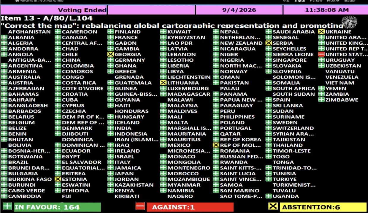
But this does not mean the UN has banned the world map we know.
The resolution is not legally binding, meaning it does not require countries or organizations to change the maps they use. It also has no effect on national borders or the status of internationally recognized and disputed territories, as the European Union emphasized in its explanation of vote.
Instead, it encourages governments, schools, international organizations and tech companies to consider equal area map projections, particularly Equal Earth, when showing the relative size of continents and regions.
So, What Is Wrong With the Familiar Map?
The map that gets most of the attention in this debate is the Mercator projection, created by Flemish cartographer Gerardus Mercator in 1569.
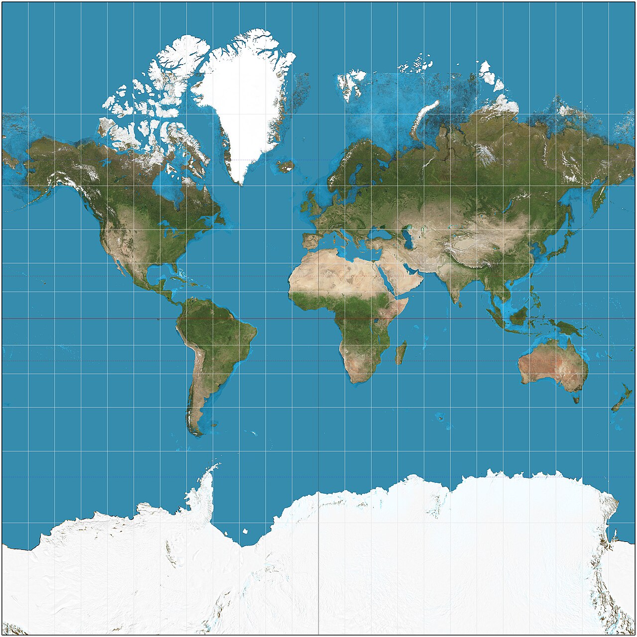
Mercator was not trying to make Africa look small. He was trying to help sailors get from one place to another.
Think of it like stretching a rubber sheet evenly in all directions, but stretching it more and more the farther you move from the center. The shapes stay proportionally correct at each point, but the areas balloon in size the farther out you go.
That is essentially the problem Mercator was dealing with. His projection keeps direction consistent, which was extremely useful for navigation. On a Mercator chart, a straight line can represent a constant compass bearing, making it easier for sailors to plot a course across the ocean.
The catch is that the stretching gets more extreme the farther you move from the Equator.
That is why Greenland can look almost as large as Africa on a Mercator map, even though Africa is actually about 14 times larger. Mercator's map was not designed to show the true size of the world. It was designed to make navigating the world easier.
Equal Earth
Developed in 2018 by cartographers Bojan Šavrič, Tom Patterson and Bernhard Jenny, Equal Earth is an equal area projection. Countries and continents retain their correct relative areas, even though their shapes are inevitably altered to some degree.
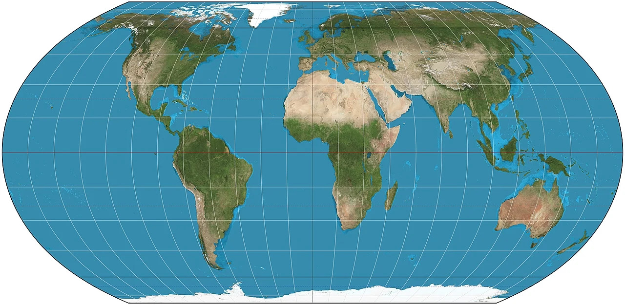
On an Equal Earth map, Africa looks much closer to its actual size relative to Europe, North America and Greenland. It also makes tropical regions appear less visually dwarfed compared with areas closer to the poles.
But there is no perfect world map. Every flat projection has to compromise somewhere, one might preserve area, another direction, another shape or distance. The UN resolution itself acknowledges that different projections serve different purposes.
What About Southeast Asia?
Southeast Asia is an interesting case because much of the region lies relatively close to the Equator. That means countries such as Indonesia, Malaysia and Singapore do not experience the extreme size distortion seen at high northern or southern latitudes.
Still, changing the projection can alter how the region looks in relation to the rest of the world.
Read here to learn more: The Shocking Truth About Maps: Southeast Asia Is Bigger Than the European Union
In this case, an equal area map simply provides a more accurate sense of the region's geographic scale compared with other parts of the world.
Will We Stop Using Mercator?
Probably not.
Mercator remains useful for navigation, and the UN resolution explicitly does not seek to change established navigational practices.
The bigger change could happen in classrooms, textbooks, media and digital maps, where showing the relative size of continents may matter more than preserving navigation friendly directions.